Mobile advertising has grown by leaps and bounds, as the mobile audience has grown, and as brands and agencies have grown more fluent with the kind of data and message that resonate on smartphone screens. IAB has helped establish standard mobile ad units, and created under-the-hood specs like MRAID, that help companies make mobile ads that scale. However, we are always looking to showcase new and innovative ad concepts that will help publishers monetize ad inventory, while also helping brands create ad experiences optimized for the mobile environment.
To that end, IAB partnered with Celtra and PadSquad to take a look at an emerging mobile ad concept, the scroller. Although not an IAB standard unit, several vendors offer variations on the scroller concept, and publishers have started to adopt it. The scroller runs inline within a content feed, scrolling smoothly onto and off the screen as a user scrolls through an article. While it’s a large canvas, because it is inline in a feed it does not run on top of or block underlying content, a major user annoyance. It’s a little hard to do it justice with a verbal description, though Celtra describes its Interscroller, a prototypical unit implementing the scroller concept, as having these distinguishing characteristics:
- Provides a natural introduction and dismissal of an ad through a simple swipe gesture;
- Offers plenty of room for creative storytelling that makes a brand stand out; and
- Puts the creative in the center of attention without being intrusive.
We used the Celtra interscroller to build a scroller ad for this test. PadSquad, which supports the interscroller format at scale across premium publisher properties, built a scroller ad, as well as an equivalent expandable 320×50 banner, to use as a baseline for comparison. We tested a Schick Hydro ad, and we’re grateful to Edgewell Personal Care for allowing us to use their creative assets for this test. PadSquad’s team created four test ads total, a scroller and an expandable banner for both the men’s and women’s razors.
We engaged Millward Brown Digital as our research partner, to conduct a brand study on a panel of consumers who each saw one of these ad executions. Millward Brown Digital surveyed the panelists about awareness of and favorability toward the brand and the message tested, as well as some broader questions about the creative and format. They then compared the data from the scroller viewers to those of the expandable banner viewers.
Before we get to the results, it’s important to stress that we believe any new ad concept has to deliver a positive user experience. The scroller we tested measures up well against the IAB’s LEAN principles.
- The test creative was a smaller file size than the expandable banner with which we compared it.
- Publishers can deliver scrollers as encrypted and ad-choices supported.
- And as an in-feed unit, the ad does not block any underlying content, and the viewer has full control of scrolling the ad onto and off of the screen, so it is non-invasive. (Additionally, the strong performance of the concept in our test reinforces that the consumers in our test did not view it as invasive.)
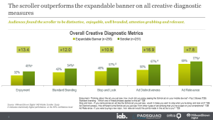
The bottom line is the scroller worked very well. It boosted awareness, ad recall, and purchase intent, outperforming the standard expandable banner in nearly every category. Equally importantly, it was a hit with the audience. Respondents viewed the scroller execution as less invasive than other ad placements, even though it was just as large as the expandable banner.
Some particular highlights of how the scroller performed relative to the standard expandable banner:
- Boosted aided category awareness by almost 26 percent (56% versus 30%).
- Increased ad awareness by almost 10 percent (46% versus 37%).
- People who saw it were seventeen percent more likely to perceive the ad as “distinctive” (67% versus 50%).
- And they were also thirteen percent more likely to say they enjoyed the ad (45% versus 32%).
 Thirty-five percent of the people who saw the scroller expressed positive feelings about how the ad revealed itself (relative to only 16 percent who said the same for the standard expandable).
Compelling in aggregate, the findings were even more interesting looking at specific consumer categories.
- The ad worked well for all ages, but Millennials showed a particularly strong response to the way the scroller revealed itself, with 44% expressing positive feelings about it (as compared to 31% of those over 35 years old).
- Both males and females showed statistically significant increases in aided category awareness. While women saw the larger brand increases, men were much more impressed with the scroller’s look and feel than women were. Men were also more likely than women to respond positively to the way the ad revealed itself (44% versus 26%)—though both men and women liked it better than an expandable banner.
- Finally, comparing Schick users to non-users, the non-Schick users drove large increases when considering creative metrics, although this was partially because Schick users had higher baselines across the board, making it more difficult for the scroller to move the needle on results.
These results demonstrate that you can create scalable ad experiences on smartphones that viewers find appealing. The scroller concept is one that can convey an ad message that breaks through, while at the same time revealing itself in an appealing way and being an enjoyable ad experience, particularly for the millennial and male audience segments. We hope that executing and publishing research like this will encourage the industry to actively seek, propose, and validate innovative mobile ad concepts that enable engaging creative while adhering to the LEAN principles.
